5 Signs Your Website Is Working Against Your Business
5 Signs Your Website Is Working Against Your Business
Your website doesn’t have to look terrible to be costing you business.

A website can look perfectly fine and still not be doing its job.
The colors are nice.
The logo is there.
The contact information is somewhere on the page.
Nothing is obviously broken.
And yet potential customers visit, look around and leave without taking the next step.
That’s because a website isn’t simply a digital brochure.
For many businesses, it’s the first real interaction a potential customer has with the company.
Before they call you, email you, visit your store or schedule an appointment, they’re often trying to answer a few basic questions:
What does this business do?
Is this what I’m looking for?
Do I trust them?
What should I do next?
If your website makes those answers difficult to find, it may be working against the business instead of supporting it.
Here are five signs that might be happening.
1. Visitors Have to Work Too Hard to Understand What You Do
One of the most common website problems is also one of the easiest to overlook.
The business owner understands the business so well that the website assumes everyone else does too.
But a new visitor doesn’t have that context.
They shouldn’t have to read several paragraphs, click through multiple pages or decode clever language to figure out what you actually offer.
Your homepage should help someone quickly understand:
what you do,
who you help,
and why they might want to keep looking.
That doesn’t mean every detail needs to appear at the top of the page.
It simply means clarity should come before creativity.
Because if someone can’t quickly understand the business, the rest of the website has a much harder job.
2. Your Website Still Represents an Earlier Version of the Business
Businesses evolve.
Websites often don’t.
Maybe you’ve added services.
Maybe your ideal customer has changed.
Maybe the quality of your work has improved significantly.
Maybe your pricing, positioning or expertise has moved into an entirely different category.
But the website still looks and sounds like the company you were three years ago.
That creates a disconnect.
Someone may receive a glowing recommendation, visit your website and encounter something that doesn’t match what they were told.
The business may have grown.
The website simply hasn’t caught up.
3. There’s No Clear Next Step
A visitor likes what they see.
Great.
Now what?
Should they call?
Schedule?
Request a quote?
Visit a location?
Fill out a form?
Buy something?
Read more?
One of the most important jobs of a website is helping people move forward.
But many websites unintentionally make that difficult.
There may be five different buttons competing for attention.
Or no obvious button at all.
Contact information may be buried.
A service page may end without telling the reader what to do next.
Every page doesn’t need to aggressively sell something.
But the visitor should rarely reach the end of a page wondering:
“What am I supposed to do now?”
4. It Works on a Computer but Falls Apart on a Phone
This one matters more every year.
A website can look beautiful on a large desktop screen and become frustrating the moment someone opens it on a phone.
Text becomes too small.
Buttons are difficult to tap.
Images crop strangely.
Menus become confusing.
Pages take too long to load.
Or the most important information gets pushed far down the page.
Your customer doesn’t care that the desktop version looks great.
They care about the version they’re actually using.
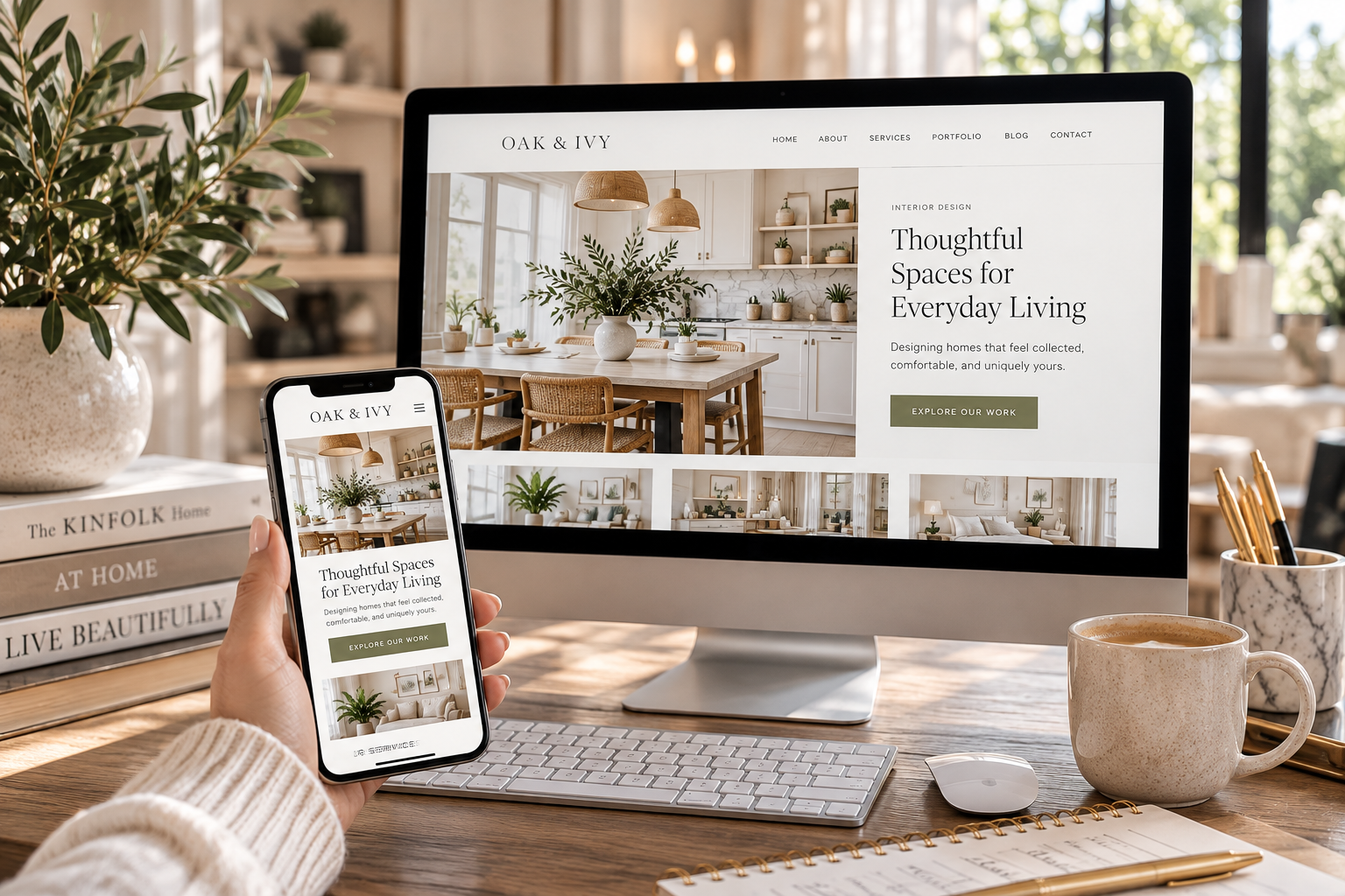
A strong mobile experience isn’t an extra anymore.
It’s part of the website.
5. You’re Hesitant to Send People There
This may be the simplest test of all.
Someone asks about your business.
Do you immediately send them your website?
Or do you find yourself explaining around it?
“The website is a little old.”
“We haven’t updated that page yet.”
“That service isn’t on there.”
“Don’t pay attention to the photos.”
“We’re actually redoing the site soon.”
If you regularly feel the need to apologize for your website before someone even opens it, that’s useful information.
Your website should make your job easier.
It should reinforce what you’re already telling people about the business—not require an explanation before they see it.
A Better Website Doesn’t Necessarily Mean a Bigger Website
One of the misconceptions about improving a website is that it needs more.
More pages.
More animations.
More features.
More copy.
More everything.
Often, the opposite is true.
A stronger website may simply need clearer messaging, better organization, stronger photography, more intentional calls to action and a design that reflects the quality of the business.
The goal isn’t to impress someone with how much is on the website.
The goal is to make it easy for the right customer to understand the business and take the next step.
Your Website Should Be Working for You
A good website doesn’t replace good service, strong relationships or word-of-mouth.
It supports them.
It gives someone a place to learn more after hearing your name.
It helps a referral feel confident reaching out.
It answers questions when you aren’t available to answer them yourself.
And it gives your business a professional home online that you’re proud to send people to.
At Fourth & Grace, we help businesses create websites and digital experiences that don’t just look better—they work more intentionally as part of the larger brand and marketing strategy.
Because your website shouldn’t simply exist.
It should have a job to do.
Ready for a website that works as hard as your business?
Let’s bring your website, digital presence, brand and marketing into alignment.
Let’s Connect